 When looking at the Apple advertisement from the 1970's in comparison to the Apple advertisement from today, it is clear that there has been a massive change and shift in society, aside from the technological and design change.
Firstly if we look at the advert from the 1970's and break down the signs we can see the differences more clearly.
1.the signs - computer, male, female, pad, pen, kitchen, table, cup, chart, graph.
2. these signify - the woman in the kitchen can easily be seen as the average woman for this era. We get the impression that she is waiting on the husband while he works from his computer. The cup in his hand gives the impression that his wife has made him a cup of coffee while he is hard at work. His pen and pad symbolize his work and the extent which he has to do. She is looking at her husband in a loving stare while he concentrates on the computer.
3.This gives the meaning that apple products are great for work related subjects and will keep the family 'happy'.
4. The social norms that this promotes is that the woman is the 'housewife' while the male does all the work. The apple product is aimed at the male. He is the one who makes the money while his wife takes care of him for taking care of her financially.
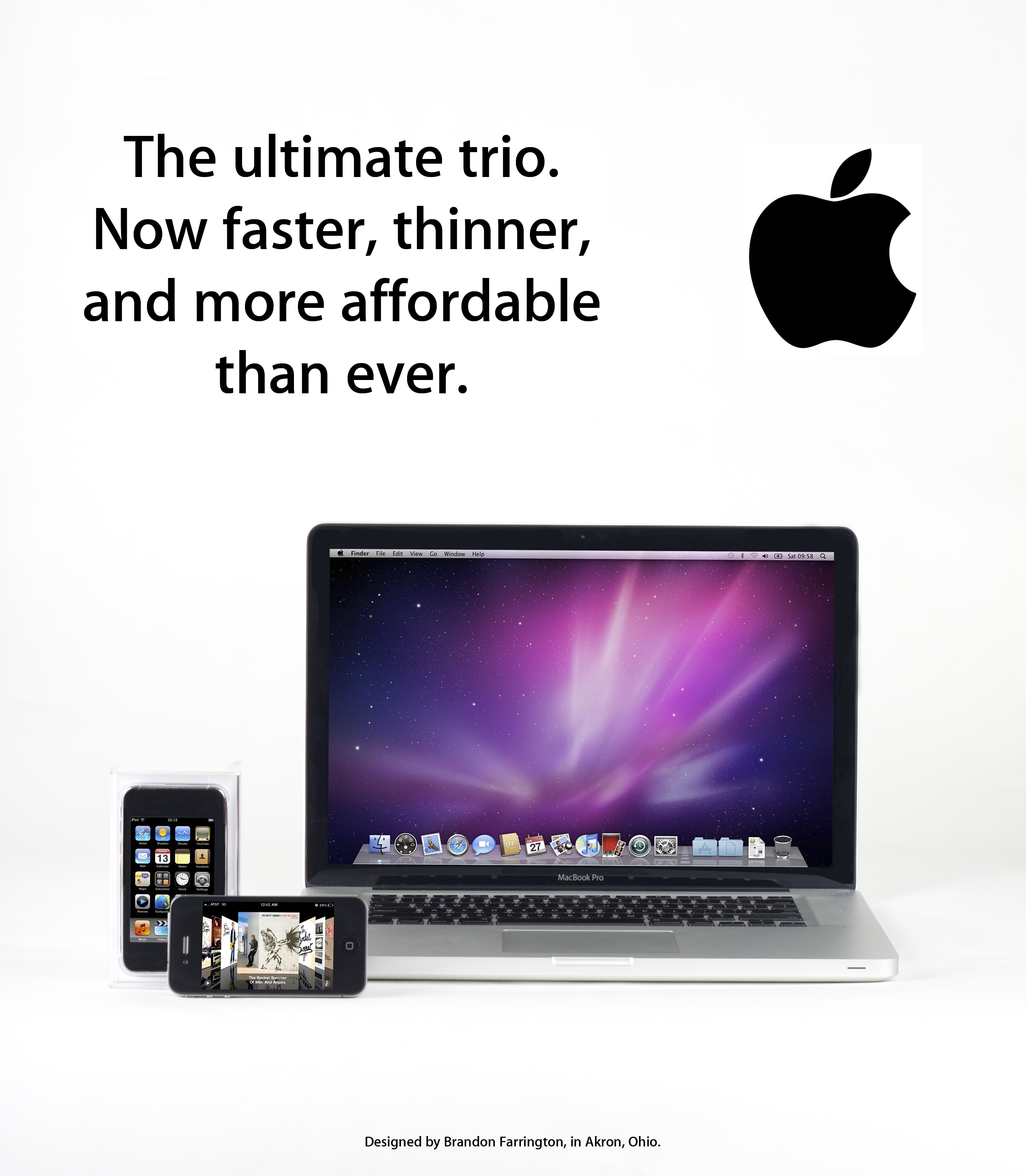 In comparison to the Apple adverts of today we can clearly see a massive change. Now when we think of Apple adverts we see clear backgrounds with striking bold colourful images. We very rarely see people in the advertisements of Apple products.
1. signs - computer, bright light, phone, logo, text, white.
2. signify - computer signifies a lot more than what it used to, not only is it used for work, but also play. Unlike the 1970's a computer means a lot more and signifies a lot more than previously. The phones signify more too, not just mere communication, also education and entertainment. The plain white background seen in many Apple ads show how simple yet extraordinary the Apple is.
3. These show that Apple is an ever changing technology, its vibrant purple burst of light represent the scientific extremes that the Apple producers go to and gives us the feeling of space.
4. This advert doesn't fit in with the social norms of the 70's, unlike the previous advert it does not include a background or people. However it does suggest that people of today's day and age understand Apple and have heard of their products. 'Now Faster, thinner and more affordable than ever indicates that we as humans are becoming greedy. We want the fastest and the best for the cheapest we can. Again unlike the 70's ad, this advert doesn't feel the need to have the words Apple on the print ad. Suggesting that everyone knows Apple from the logo itself.
No comments:
Post a Comment